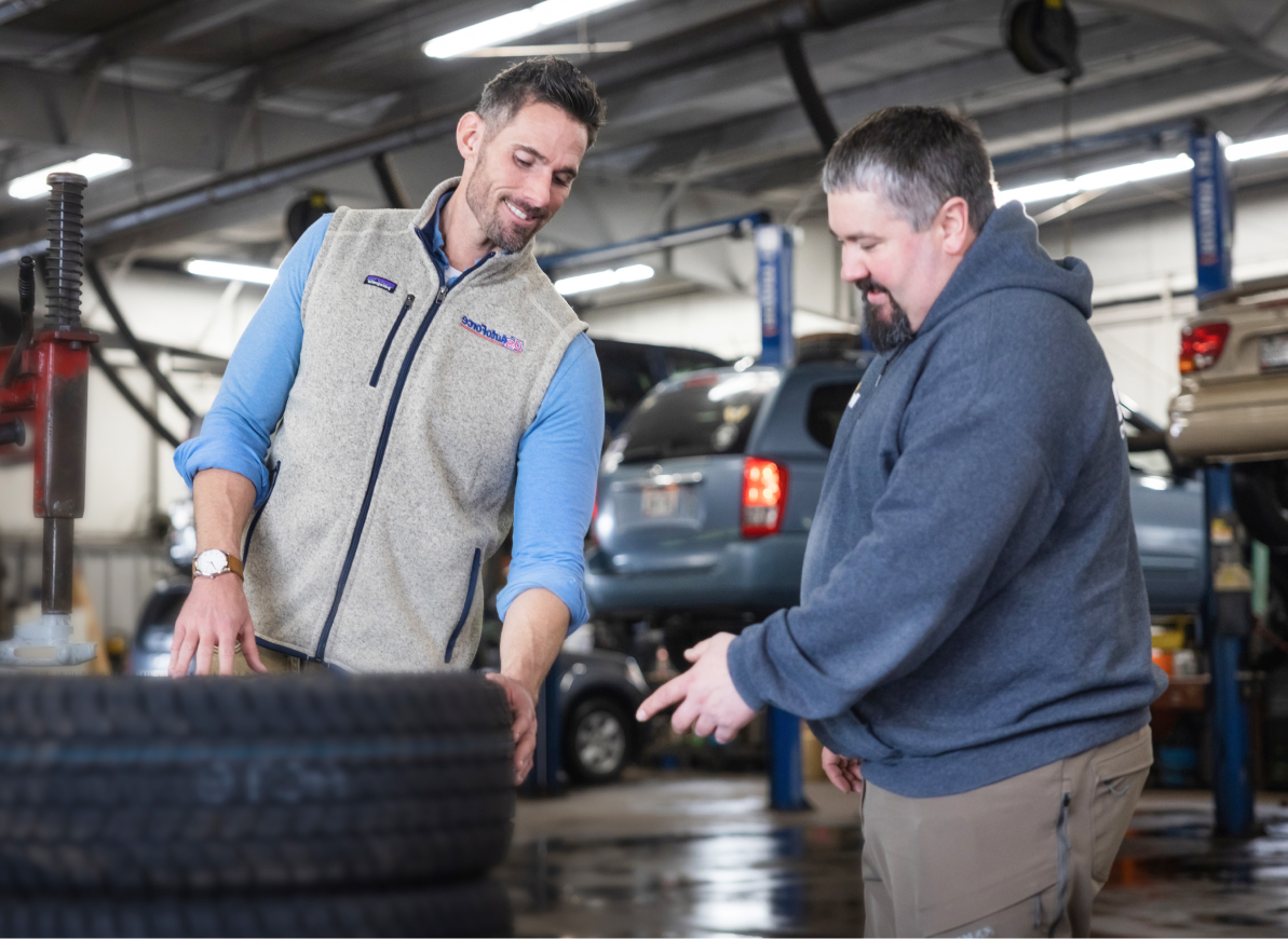
Skip To Content
Customer Service: (800)-490-4901
Customer Service (CA, AZ, NV): (800)-655-8851
A division of
US Venture
Mobile Nav Toggle Menu

Blog

« Blog Home

Think Out of the Box, but Color Inside the Lines: The Basics of Effective Business Signage

U.S. AutoForce - Monday, February 27, 2017

Whether you’re a tire retailer or automotive service center, a commitment to effective signage design has the ability to radically impact business performance. The potential benefits of effective signage include increased traffic, profit, customer satisfaction, and retention. Given the value of these benefits, a commitment to a strong signage strategy needs to be an integral part of any business’ marketing plans.

It is imperative that store signage be a professional, well maintained reflection of who you are as a business. Signage has the ability to not only convey information, but to create anticipation and positive expectations about the experience the consumer is about to have. A few key things to consider:

COLOR: Think outside the box, but color inside the lines. Color contrast is the KEY determining factor when it comes to sign readability and customer content retention. Choose bold text on contrasting backgrounds. Black on light (white or bright yellow) backgrounds, or white text on dark backgrounds work best. This is one of those times when you can’t let your desire to be “creative” get in the way of effective sign design. No matter how much you might like Christmas colors, resist the urge to make a sign with green letters on a red background. While festive, the degree of contrast is so poor that you’re doing customers (and yourselves) a huge disservice in terms of legibility and their ability to effectively consume the sign content.

SIZE: Consider both the sign size and font size from the customer’s vantage point. Will they be viewing the sign from the road, from your driveway, or will they be up close? The industry standard with regard to font height is 1 inch of height for every 10 feet of customer distance. Thus, if your sign is going to be viewed from 40 feet away, you need to have letters that are a minimum of 4 inches tall.

FONT: You want signs that are a strong reflection of your brand, but give careful thought to the fonts you use. Script and other complicated fonts that look great on paper may not work at ALL on signage. Choose bold, simple, easily read fonts for maximum impact to the greatest percentage of sign viewers. If you have a logo font that is less-than-ideal for signage, don’t sacrifice your signage legibility in the name of consistent branding. Instead, evaluate the logo itself, or choose a neutral font that works from a signage perspective but doesn’t “clash” with the other brand elements associated with the business.

Well-designed automotive signage requires an organized strategy. It is imperative to ask yourself a few questions:

  • WHO is going to be viewing this sign? Is it being viewed by someone driving down the street, or someone who is already in the store being serviced?
    • Signage design must always be approached from the CUSTOMER perspective. First determining who will be viewing the sign, (and what their vantage point will be), needs to be a driving force in what your sign should look like.
  • WHAT is the most important message you want them to receive? Are you trying to get a customer to stop into your location to take advantage of a discounted oil change, or are you trying to get them to upgrade their purchase once they’re in the service lane?
    • Once you determine your key message or messages, it is imperative that you PRIORITIZE your content. No one is going to read a novel printed on the side of a sign, so give careful thought to how to convey the MOST important messages as simply as possible. Outdoor billboard companies advise businesses that an effective billboard design (as an industry standard) contains no more than 7 words. You can get away with more than that in most instances of automotive service center signage, but it illustrates the point—-be HIGHLY selective about your messaging if you want that message to be consumed effectively.
  • HOW do you want them to respond to the sign? Ultimately, most forms of marketing are about trying to influence behavior. Signage is no exception. Whether you’re trying to drive traffic into the business or trying to upsell a customer, you need to be clear in your own mind about how you want people to respond BEFORE you ever sit down to design the sign.

Ultimately, whether you’re a tire retailer or automotive service center, the signage you display becomes the identity of your business. If your signage is poorly maintained or hard to read, it conveys negative feelings about your business before people ever set foot on your lot. Conversely, well designed, bright, well maintained signage makes people feel good about patronizing you. It sets the tone for the experience they are about to have, and it creates the expectation of satisfaction before you’ve even provided service to them. Thus, as you plan your business marketing efforts, be sure to include a detailed signage plan that outlines signage types and objectives and becomes your driver of strong design decisions to maximize the opportunity offered by well planned and executed signage.